
rice 'n fire
Rice ’N Fire is a virtual restaurant in New York City, spun off from brick-and-mortar Copper Throat Thai Cuisine, where food is prepared. This is the future of the restaurant industry when a kitchen becomes a co-cooking space for multiple brands.
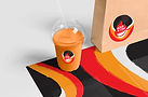
The Rice ’n Fire logo uses the widely recognizable imagery of a high-heat flame surrounding a round-bottom cast iron wok. The rough texture and brush strokes represent the wok in action and reflect the idea that a wok can be used to create many different, delicious dishes. I selected a typeface with a quick, handwritten, and casual aesthetic to convey both the speed of service and the brand’s fast, to-go nature.
Fire
#ED1C24
Rice
#E6E7E8
Hot Oil
#F7941D
Wok
#231F20


Why cook with a wok? Woks are known for their excellent heat retention and even heat distribution. They respond quickly to temperature adjustments and are slow to cool down after heating; making them ideal for stir-frying and a wide range of Asian dishes, especially in fast-paced delivery and to-go environments.
For this reason, the visual system incorporates organic, fluid shapes created by layering colors. These shapes symbolize heat retention and the movement of oil as it heats within the wok. They also evoke the motion of ingredients being tossed and cooked at high temperatures, releasing vibrant flavors and aromas.
Rice, a staple in many Asian cuisines, sits at the heart of the brand. To reinforce this, a custom rice grain pattern is developed and used throughout the overall art direction.
The icon set features simplified, bold silhouettes of key ingredients—such as chicken, shrimp, vegetables, and other staples; reflecting the diversity and freshness of dishes created with a wok. These icons maintain a consistent visual language that aligns with the brand’s energetic and approachable identity.


photography direction


Gold in Mobile Responsive Design 2021
Gold in Restaurants / Cafe 2021
Silver in Digital Design 2021
Silver in Branding 2021
Silver in Integrated Graphic Design 2021
Silver in UX, Interface & Navigation 2021
Silver in Website Design 2021